Evolve IT
New identity for cyber security experts
Seddons are a leading regional West Country estate agent. They are a progressive, friendly and outgoing firm, driven by engaging staff. Their old marketing materials did not reflect this personal. They came to us for a complete refresh of their visual identity, to better reflect how they had evolved.
We held a brand workshop with them, to help determine their values, aspirations, and the ‘essence’ of who they are and how they want to be perceived. The outcome was a move much more towards warm and friendly and modern, and away from staid and traditional. This manifested itself in many ways, most obviously an evolution of their colour palette to a more cool and contemporary mint and teal, and a new, more open, lowercase logo.
Drag to compare before and after.
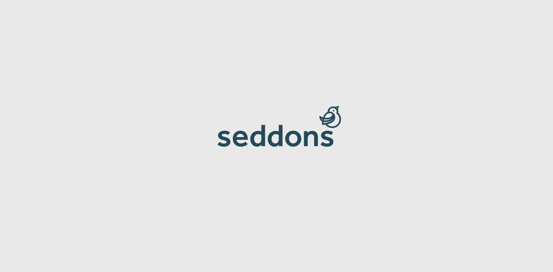
One of the major additions was a graphical bird character, representing a friendly, chatty, approachable, homely, familiar, nest building, sociable presence.
The bird appears in many different scenarios, from big friendly car graphics to ‘For Sale’ boards, often with a cut out, to give it a uniquely recognisable silhouette. And graphical cues from the shape of this happy little bird were then expanded to be used as design elements across collateral material, giving us an energetic, dynamic look that all hangs together, in what we call ‘joined up branding’.